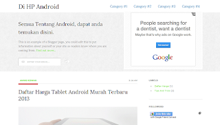
ResponsiveT is a premium blogger template with bootstrap effect. Suitable for you who want to share information to visitors about technology, news, mobile phones, operating systems and more. Features of this template is Responsive, Elegant, Dropdown Menus, Feedburner (email Subscribe box), Skin Post, Breadcrumbs gorgeous, Stylish, 3 colomn Footer, Ads Ready, SEO Friendly, and Bootstrapping style effect.
Author : Blogstipntrick, Design : Studiopress, 2013. Powerfull site template designed in a clean and minimalistic style. This template is very flexible, easy for customizing and well documented, approaches for personal and professional use. Success has been coded in HTML5 & CSS3 and jQuery. It has a solid flexible responsive layout that scales from 240px to 1200px width.
Bootstrap Blogger Template Download :
Bootstrap 2.3 includes some new features, as well as the standard bunch of bug fixes and docs improvements. Here are the highlights:
Repository changes:
Local instead of global dependencies for our makefile and install process. Now getting started is way easier - just run npm install.
Upgraded to jQuery 1.9. No changes were needed, but we did upgrade the included jQuery file to the latest release.
Moved changelog to be within the repo instead of as a wiki page.
Added container option to tooltips. The default option is still insertAfter, but now you may specify where to insert tooltips (and by extension, popovers) with the optional container parameter.
Improved popovers now utilize max-width instead of width, have been widened from 240px to 280px, and will automatically hide the title if one has not been set via CSS :empty selector.
Improved tooltip alignment on edges with #6713.
Improved accessibility for links in all components. After merging #6441, link hover states now apply to the :focus state as well. This goes for basic <a> tags, as well as buttons, navs, dropdowns, and more.
Added print utility classes to show and hide content between screen and print via CSS.
Updated input groups to make them behave more like default form controls. Added display: inline-block;, increased margin-bottom, and added vertical-align: middle; to match <input> styles.
Added .horizontal-three-colors() gradient mixin (with example in the CSS tests file).
Added .text-left, .text-center, and .text-right utility classes for easy typographic alignment.
Added @ms-viewport so IE10 can use responsive CSS when in split-screen mode.
DEMO | DOWNLOAD
Home »
2 Columns »
Blogger Templates »
Dropdown »
Inspiration »
Template Premium »
White »
Bootstrap Responsivet Blogger Template
Thursday, May 23, 2013
Subscribe to:
Post Comments (Atom)


 .
.
0 comments:
Post a Comment